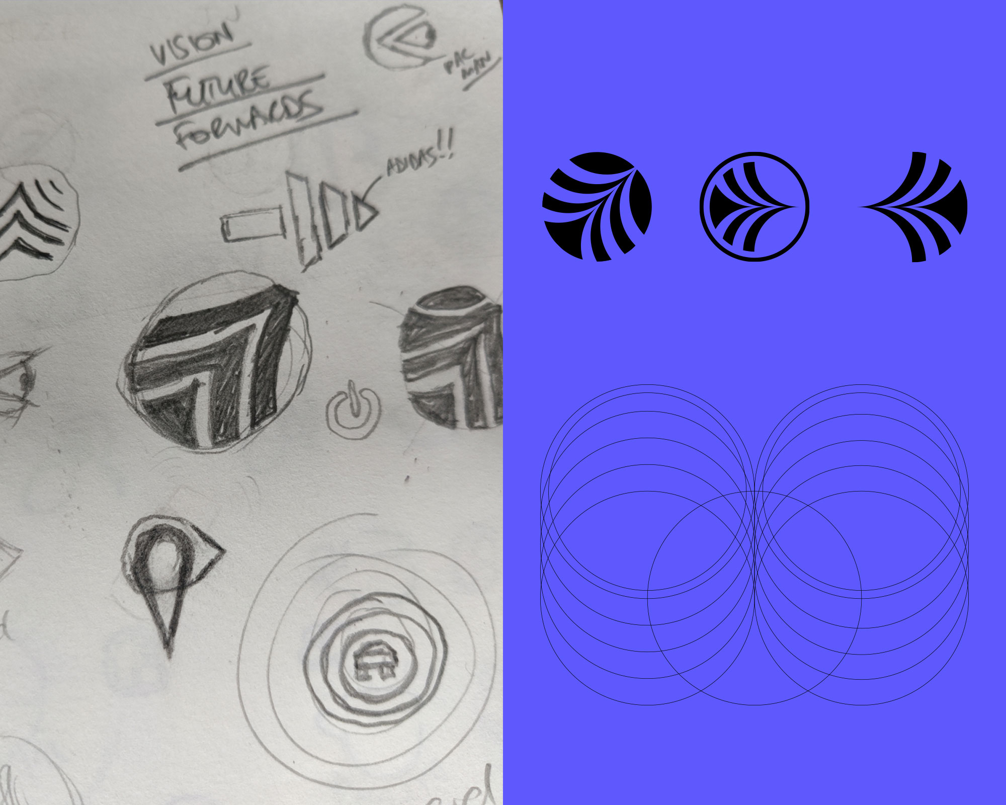
Onward logo concept design
An exploration of the logo I created for the Daily Logo Challenge. Logo design

Whilst partaking in the Daily Logo Challenge I decided to further explore the Onward logo. Onward are a fictional company that produce electric, driverless vehicles. The initial design was created from a selection of three keywords: 'the future', 'vision' and 'forwards'. Steering wheels and wi-fi signal icons have been done to death so I focused my sketches on direction, movement and looking forward.

Although I was happy with the icon it just didn't sit quite right so continued to play around with it. Upon rotating it to the right I noticed it formed the shape of an eye which reminded me of one I had initially sketched out. I continued to make minor adjustments and was over the moon with how it came out - it had the 'forwards' movement, the nod to 'the future' and 'vision'.

Colour-wise, I wanted the palette to be bright and eye-catching and something different to what you usually see in the vehicle industry. I went with a vibrant blue/purple that was complimented with light grey, black and a punch of bright pink.
